The true power of a brand lives in it’s identity.
We sat down with our Design Director, Carl, to unpack the anatomy of a lasting brand identity. Here’s what came up:
From your experience, what makes a brand identity truly enduring?
Brand identity isn’t just about looking good, great brands endure because they’re understood, trusted and felt, every design decision is made with intention. Creating an enduring brand identity is more than visual consistency, it’s about shaping a coherent experience across every touchpoint. A brand lives in how it’s encountered through products and services, spaces and interactions, campaigns and culture, all guided by a clear, shared vision. When photography, colour, typography, tone and motion work together it heightens our senses making the experience more enjoyable. These cues act as memory triggers, translating belief into feeling, because in the end, people don’t choose brands for what they say or show, but for how they make them feel long after the moment has passed.
Brand Identity is such a broad topic, so to start let’s just clarify what ‘Brand Identity’ is. Al Ries and Jack Trout called a brand “real estate in the mind.” It lives through association, how it makes you feel, what memories surface, the experiences you’ve had. Every enduring brand begins with a clear purpose, something that makes life better, and from that purpose its attitude, personality and point of difference emerge. So for me brand identity is a brand’s ability to know and show what it stands for, and the more consistently it behaves that way, the longer it stays in people’s minds. As Marty Neumeier says, “a brand is no longer what you say it is, but what they say it is.” The designer’s role is to guide that conversation so what people feel still reflects what the brand truly believes.
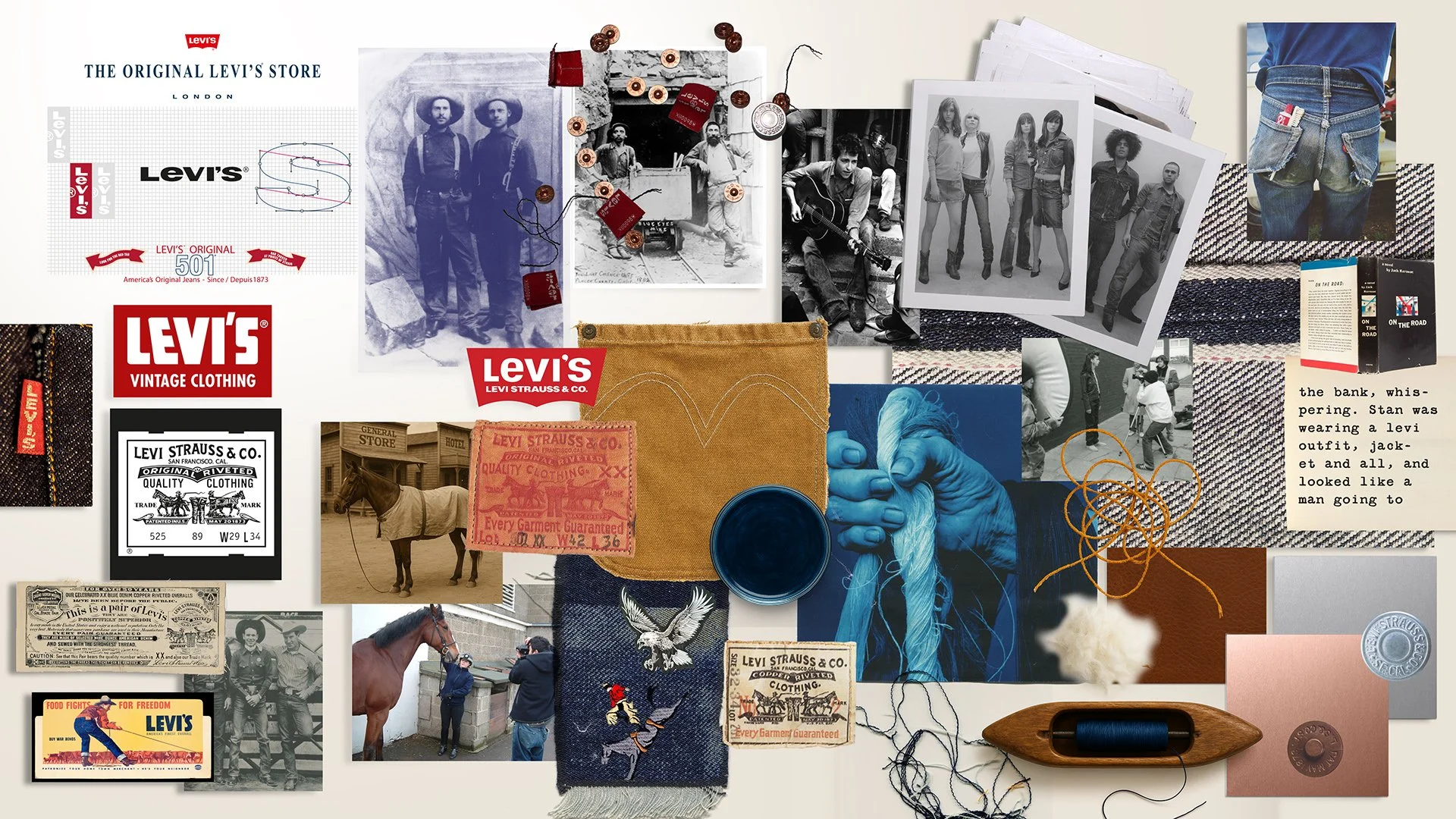
I’ve had the privilege to work for many brands creating holistic branding, but it all began with Levi’s and its pioneering spirit. When your purpose and meaning solves real people problems it transcends time and place, it crosses technological and cultural boundaries.

Levi Strauss didn’t set out to build a fashion empire, he wanted to make durable overalls for miners that wouldn’t fall apart. Levi’s became the uniform of the American frontier, worn by people pushing west, carving out possibility. Decades later, that same spirit was reclaimed by rebellious teenagers in the 1950s, then by artists and activists in the 60s and 70s, each generation finding its own voice through Levi’s. The expression changed, but the belief remained: freedom, individuality, and the courage to be yourself.
How can brands evolve whilst still maintaining their legacy?
I remember sifting through Levi’s archives in San Francisco, as the company I worked for was now the global retail guardians for the brand. It’s at this point you discover real nuggets of gold, for example, I remember Lynn Downey who was in charge of the Levi’s archive telling me the story of the arcuate, which is the stitching on the back pocket, these arcs are the spirit of freedom, they represent the wings of the American Eagle, again, that pioneering spirit is present in everything Levi’s. Brand stories romanticise truths, evoking meaning that goes far beyond the product itself.
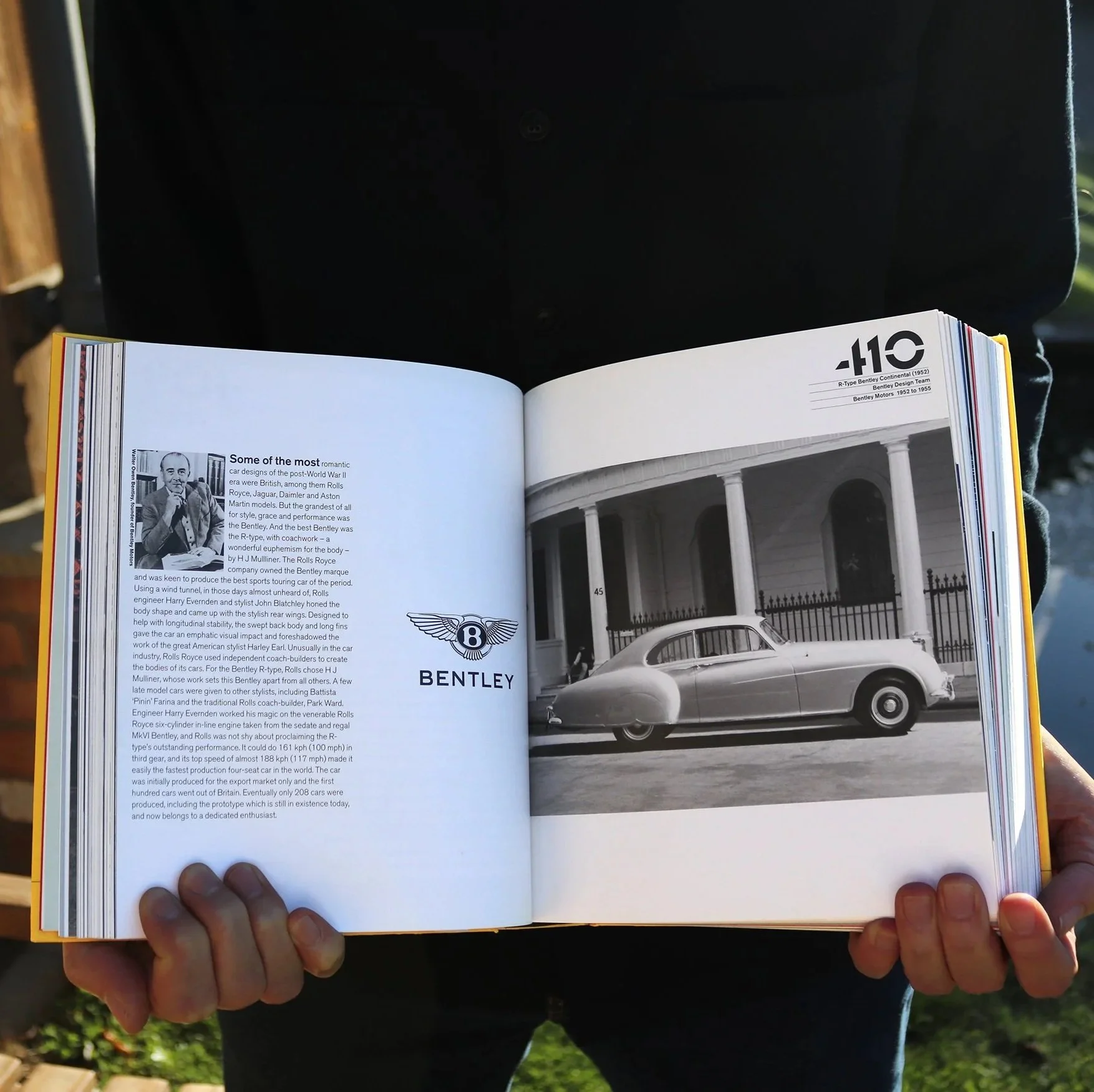
Bentley Motors has a prestigious lineage. I worked on their logo, reshaping and crafting it to best represent their values and brand truth. I went back through Bentley’s history and took the strongest elements; the ideosyncratic feather count on each wing, the bold ‘B’ set in the oval, and wings inspired by birds of prey, built for power and speed. I reduced the palette to black and white, colours associated with motion, friction and performance, that echoed W.O. Bentley’s relentless ambition “to build a fast car, a good car, the best in its class.” Every decision was made with the car in mind, so the logo felt propelled forward when it sat on the bonnet and immediately recalled the driving experience that is a Bentley Motor. The mark was engineered for production just as carefully as the car itself, sculpted for metal, translated for print using foils and embossing, and supported by bespoke letterforms inspired by the Bentley engine block.
Whether it’s the Levi’s arcuate or the wings on the Bentley bonnet, what endures is what it stands for. These stories aren’t about products, they’re about belief, purpose and feeling, carried forward through craft and consistency. The brands that last are the ones that earn a place in people’s lives by solving real needs, expressing something human, and staying true as the world changes around them. Get this right, and identity stops being something you design and becomes something people recognise, trust and carry with them. That’s when a brand moves from being seen to being felt, and that’s where legacy is made.
What has been your favourite identity project that you have worked on in your career?
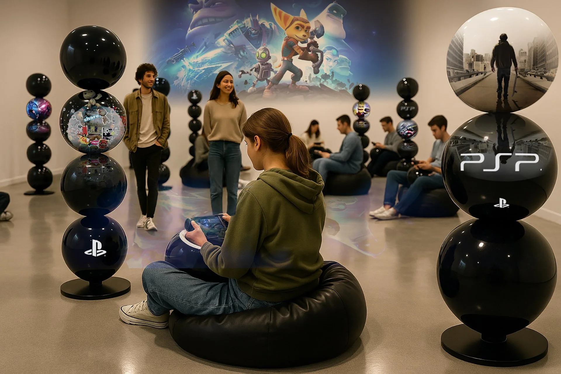
The Sony PlayStation PSP sampling assets will always go down as one of my favourite brand identity projects, the PlayStation brand truth of ‘FUN’ rings in my ears! This was an amazing project which was showcased at E3 in Los Angeles, the world’s largest gaming fair, attended by the world’s biggest electronic brands with movie sized budgets - pure Hollywood.
How do you make a sampling asset fun? The aim was to make it an experience, so ‘FUN’ is what it needed to be while aligning to PlayStation values; original, desirable, improvisational, playful, and infectious.
The idea of multi gaming coupled with security issues meant that the design which conventionally was a retail unit with wires wasn’t going to solve this one. The solution had to be as the name suggests ‘portable’, but not ‘stealable’. The birth of the ‘Porta-Ball’, a large spherical orb that housed the PSP (PlayStation Portable), that could be transported to comfortable seating areas and mats, thus creating a community experience. Printed graphics were engineered as interchangeable skins, slotted onto the Porta-ball’s outer shell, allowing fast brand swaps for festivals and live sampling events. For me designing something that becomes more than just an object but more of an experience gives a brand an identity that becomes inclusive, promotes community and addresses real people needs.
What is your favourite part of creating a brand identity?
I’m going to go back now to the late 1980s when I was in my last year studying Graphic Design, and the V&A was exhibiting Neville Brody’s work that he’d done primarily for ‘The Face’, chopping up bits of Letraset for expressive typography, really cool. This was how it was done, taking different elements to express a feeling. This is how I work by begining with moodboards, freely exploring but with the brand purpose and value’s in the back of my mind, then editing back, making sure everything is ‘on-brand’, I often heard the phrase ‘let’s shake the box to see what falls out’, meaning that everything included on the board had a place and wasn’t just decorative.
Brand identity is never built alone - it’s a collective. That’s where strategy comes in - understanding where a brand has been and where it needs to go, not only from a business perspective but also visually, verbally, emotionally and behaviourally. When strong strategy underpins the work, creativity has purpose, and seeing everything come together is so rewarding.
How important is internal culture when it comes to building and maintaining an identity?
Internal culture is so important. It’s the energy that drives a brand, what people say, do and believe. When everyone is aligned, that momentum is amplified through word of mouth and shared experience. Culture isn’t just people; it’s the spaces, tools, rituals and everyday choices that surround them. Get that right, and the brand becomes something people don’t just work for - they belong to. This alignment should happen from day one, even before someone joins. A rallying call, a sensory signal that says “this is who we are”, a tribal sense of connectivity and community.
How do you see the role of AI evolving within brand identity?
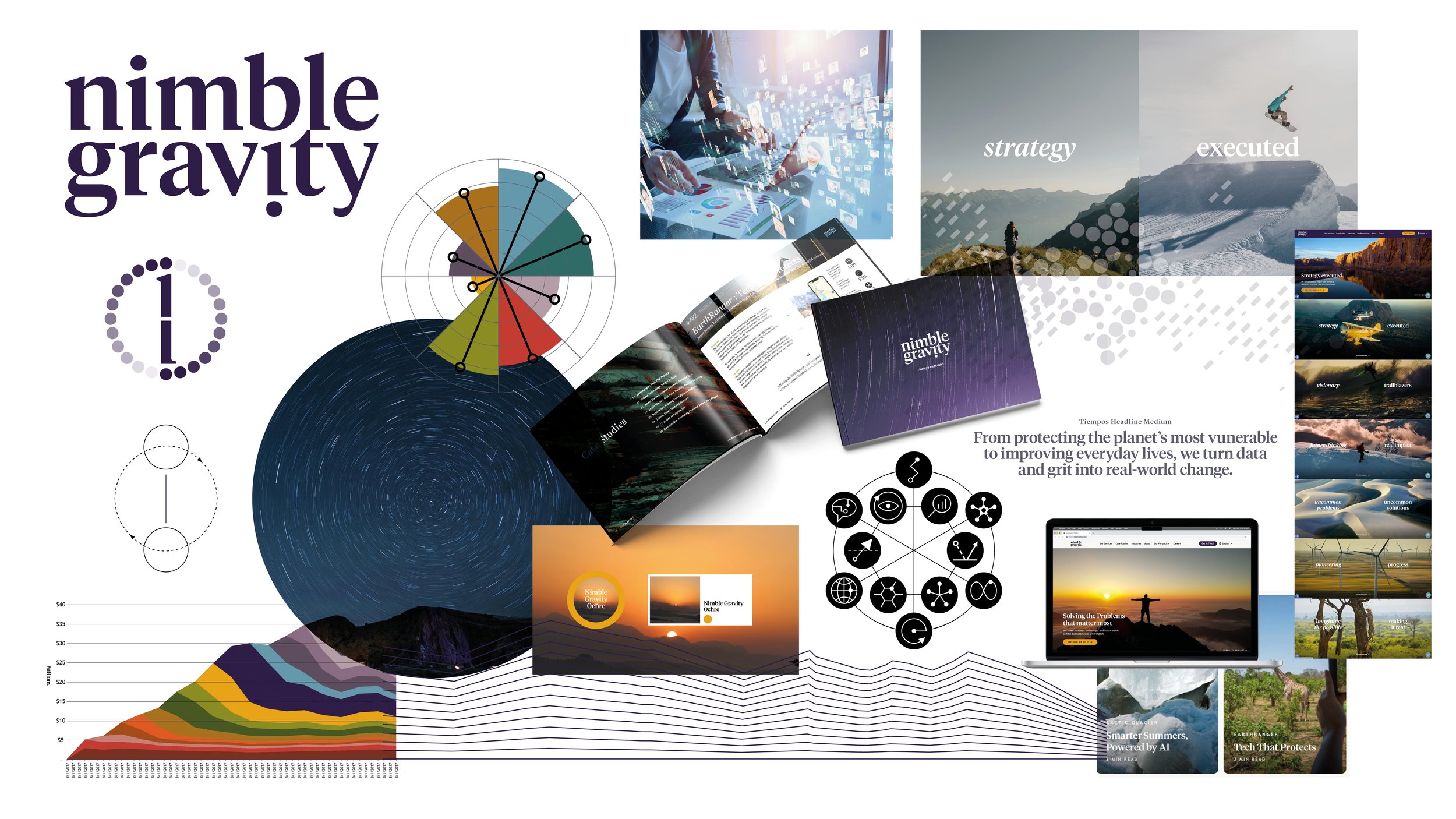
We’re already seeing this in action. Brands like Nike, BMW and IKEA are using AI to design more intelligently - testing faster, reducing waste and extending product life, while staying true to what makes them authentic. The same thinking shaped our work for Nimble Gravity, where the challenge was turning complex analytics into clarity and emotion. Guided by their dual archetypes, Sage and Outlaw, the result was an AI-assisted identity that feels intelligent, grounded and alive - proof that data, when handled with care, can still have soul.
As Matt Parry often says, we’re living in an age of augmentation. AI can take care of the heavy lifting, freeing creative teams to focus on what machines can’t; empathy, storytelling and meaning. In a world craving truth and connection, the brands that endure will be the ones that use intelligence to stay human.
Levi’s Strauss & Co - D&AD Retail Environment Nomination, McNaughton’s Review Winner - Brand Book Category.
Sony PlayStation Europe - European Popai Award Gold POP / UK Popai Award Winner POP.
Bentley Motors identity featured in Phaidon Design Classics books, No:410